This page explains how to change your marketplace’s appearance to match your branding. The internal Styling tool presented in this guide can be used to change the appearance of most items across your marketplace, however considering the items appearing within your marketplace are dependent on the features that are activated, this internal tool cannot be used to change the design of all elements. There is a CSS field within the Styling tab that can be used to change the appearance of all items across the marketplace. If you have knowledge of using CSS you can make these changes yourself: guidance on using the CSS tab is here. If you do not have knowledge of CSS, then we can make the required changes for you, charged at our standard rate.
Video Guide
Step by Step Guide
This menu item has been updated for easier navigation. Its new appearance when navigating to this page is:
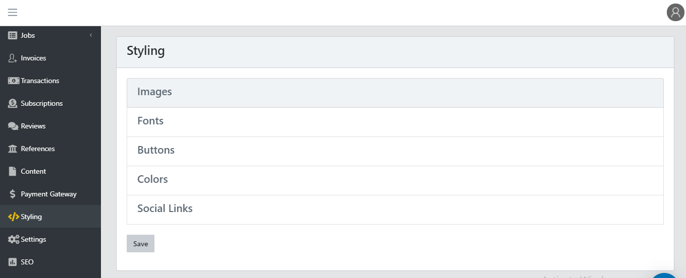
Images
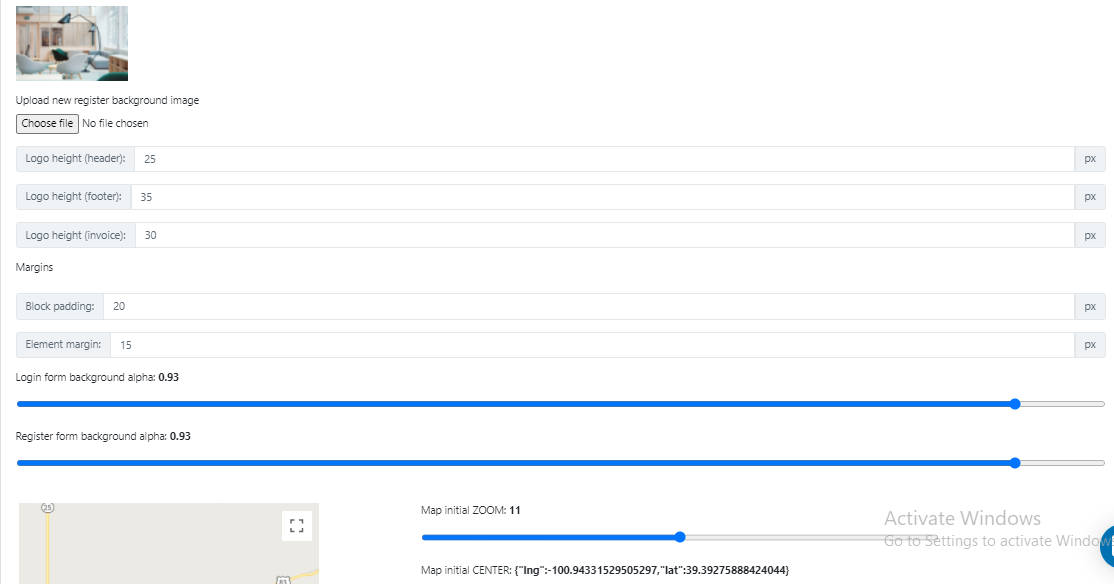
Upload your logo (it appears in the header and footer) and favicon (image of the browser’s window tab) in .PNG format. Depending on the size of the logo image it may need to be adapted by changing the logo height. After changing the value it must be saved before the new logo size will appear on the marketplace. There is a feature you can enable under ‘Settings’ to ‘Add different logos to the footer and login/register pages? (Optional)‘. This is useful if you have a different colored header and footer and want a different logo to appear in each.
The background images for the registration and login pages can be changed from here. To alter the transparency of the login/registration blocks scroll down to the background alpha factor, and slide left for higher transparency or right for more opaque.
The Element margins affect the gap between items in a block (the blank space between buttons for example). The Block padding is the gap between the block outline and the elements within the block.
If you choose to have the map feature enabled (‘Settings’ menu item), you can set the location and zoom level by clicking and dragging on the map.
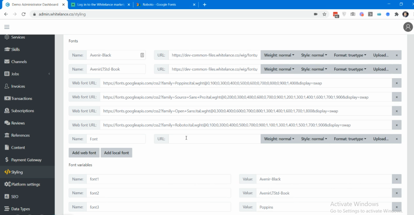
Fonts
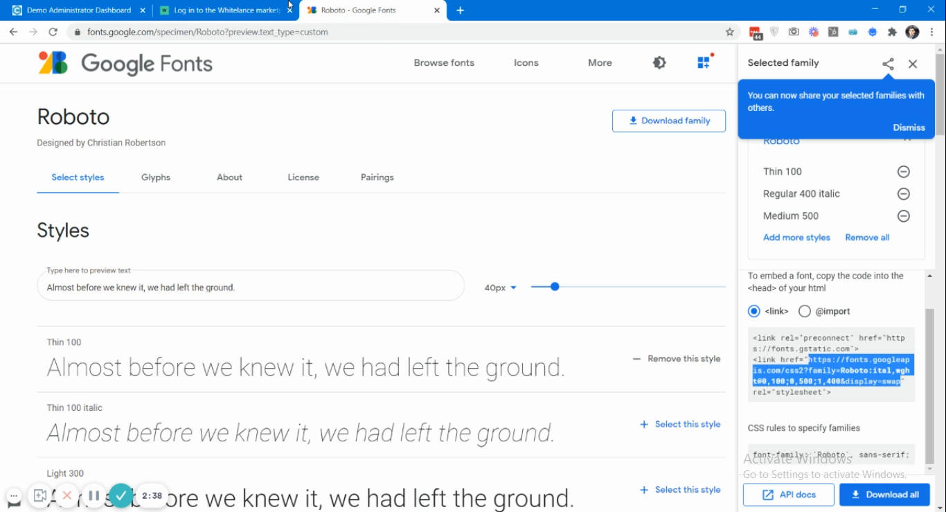
You can upload a local font from your computer by selecting ‘Add local font’ and then ‘upload’, or use a web font, which you can choose by following this link: https://fonts.google.com/.
Once you have selected the font styles, you must click ‘View Selected Families’ and copy the link into your dashboard.
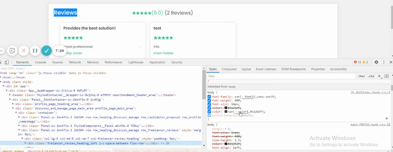
Different fonts are used in different places, with the most frequently used font being ‘font 3’. To change font three from ‘Poppins’ to your new font, change the name in the ‘Value’ section. To figure out which font is used in a specific place, right-click on it and click ‘Inspect’ to find the font name in the CSS.
Buttons
There are three types of button- ‘Primary’, ‘Cancel’ and ‘Delete’. Each button has three states: display (how it typically appears), hover (when the mouse passes over it) and active (when a user clicks on it). Each button’s state can be managed to change the color (of box and text), size, weight, style, shadow, border, font and more.
In a similar way the dropdown menus, text inputs, paragraph inputs, header and footer sections can be styled. Several of these sections also have a default, hover and active state, each of which can be adapted to match your branding.
Some of the key button fields are listed here for your convenience to assist you in changing the appropriate items for the changes you want on your marketplace. Note that this list is not exhaustive, and the changes may not be applied if the relevant features are not activated. If you cannot find the styling option to change the appearance of an item then it can be done using CSS.
Primary button styling: This affects the majority of the buttons across your site. Primary buttons include the ‘register’, ‘log in’, ‘save’ (for all items on user profile), ‘upload CV’, ‘Copy profile link’, all buttons on the search jobs page, create proposals page, ‘add milestones’, ‘send to client’, ‘view jobs’, ‘call’, ‘manage job’, ‘proposals’, ‘download invoice’, ‘invite freelancer’, ‘book product’, all buttons on the /products page, and /list-all-proposals page and more.
While navigating through your site, you will notice that some buttons have a different appearance, even through they are listed here as ‘Primary’ buttons. This is because their styling is being overwritten by CSS. For example, if you navigate to the freelancer’s search jobs page, the first button has the default primary button styling, but the other two options do not. By going to the CSS under /freelancer/search-jobs, there is the code for the freelancer search job item buttons, where the nth of type is adapting the appearance of the other buttons on this page. The same is true for the /customer/jobs page and others. This is useful to differentiate a button from other buttons of the same type.
Menu button styling: There is a feature under Settings to ‘edit your menus?’. When this feature is enabled, you can go to ‘Menu’ in your admin dash to change your menu item names, locations, appearance, and choose whether you want to ‘Show as button’. In the image below, the Support option has been selected to appear as a button. The font color and button color were set from this section.

Default Menu button styling: This option changes the appearance of the menu items when the ‘Edit your menus?’ feature is enabled, and the option to ‘Show as button’ is NOT selected. The menu items in the image above were set from here.
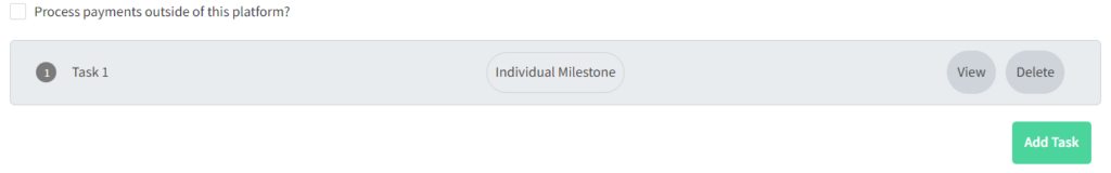
Milestone button styling: When this feature to ‘Use a more user-friendly Milestone design?’ is enabled, you can change the appearance of the ‘View’, ‘Edit’, ‘Close’ & ‘Delete’ buttons on each milestone tab, shown in the image below.
Milestone collapse styling: When the same feature as mentioned above is enabled, the milestone block’s color can be changed (currently set as grey by default). The hover and active states are not activated in this section as the collapse styling is not a button.
Milestone label styling: Similar to above, here you can edit the appearance of the central title, ‘Individual Milestone’ in the above image. Note that as this is not a button the hover and active states are not activated.
Delete button styling: This button appears when removing items from one’s profile (portfolio, work experience, education etc).
Cancel button styling: Appears when cancelling the addition of new milestones or cancelling the input of new information within profile blocks.
Dropdown styling:
- Border-color: Default color of drop-down box outline. Drop-down boxes can appear on the registration, profile, search jobs and search freelancers pages, depending on the custom data types and features you have enabled
- Color: Placeholder text color within drop-down box
Dropdown styling select area: The outline of the dropdown list when a user activates the dropdown box.
Dropdown styling menu item (hover): Sets the styling of the options when the mouse hovers over each item in the drop down list.
Input styling:
- Border-color: Box outline of text input fields. These appear on registration, log-in, profile, search jobs, search freelancers, proposals, manage jobs page and more.
- Color: Text color of the input field (both placeholder and inputted text color)
Large text input styling: Set the styling for title inputs on some profile items from here (ie protfolio).
Paragraph Input: Set the styling for introduction, work experience description, portfolio description, education description, cover letter input field, job description on /post page.
Header:
- Background-color: Color of entire header section (around logo, avatar and menu items)
- Text-color: Color of menu items and Top avatar when ‘edit your menus?’ feature is not activated
- Sub menu color: Header menu dropdown text color when ‘edit your menus?’ feature is not activated & avatar dropdown text color
- Sub menu color (hover): Header menu dropdown hover text color when ‘edit your menus?’ feature is not activated
Footer: Set footer background color and footer text color from here. Changing the appearance of the social links is below.
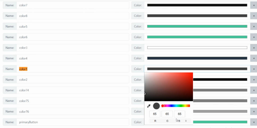
Colors
The colors of all parts of the marketplace can be adapted in this tab. To change the color of a specific item, right-click and ‘Inspect’ to see the CSS and find the color name. In your admin dashboard find that color name and change it- either by selecting a color, using a HEX code, or changing the RGB values. Note that other items using the same color name will also change to the new colors.
Social Links
Add links to your social media pages. These links will activate the Facebook, LinkedIn, Twitter or Instagram icons in the footer of your Marketplace Website. More information in this guide.